

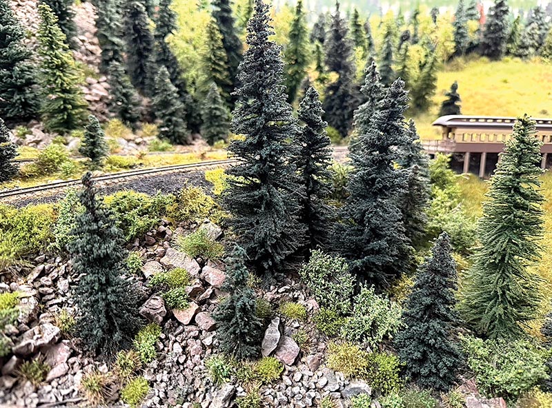
 Craig Symington, MMR/photos by the author
Over the previous issues of the GAZETTE, I’ve been sharing techniques from my efforts to upgrade my layout’s scenery to a higher standard. Unfortunately, I have mistakenly skipped past explaining the basic artistic concepts that are the foundation for those techniques. I created these articles to help people who struggle with creating scenery on their model railroads. I have also hoped to inspire the modelers of well-sceniced layouts to try some new techniques too. In this issue I’d like to correct my oversight and have a “down to the basics” talk about art and scenery techniques.
I’ve always been interested in visual arts and been blessed with an “artist’s eye” where I can break a scene down into its fine components of shape, texture and color. I’ve also been cursed like most artists in thinking my art is never good enough. After all the recent GAZETTE articles on scenery, I’ve failed to explain the artistic basics that is the basis for those techniques. With this issue I’m going to take a step back to the beginning and talk about some artistic foundations that we should all consider if we want to create realistic scenery.
Regardless of the medium, all art comes down to three basic details; shape, texture and color. When I was taking art classes, I had an excellent teacher who reinforced those principles. He would bring in a random object into the studio for the class to draw. A regular subject of his was an old tree stump with lots of roots which gave it a gnarly woven appearance. He would have it sitting upright in the middle of the studio and we would draw what we saw. Then halfway through the class he would turn the stump upside down. The first part of the class was easy because everyone knows what a tree stump looks like, and with that familiarity our brains would fill in the pieces that we wouldn’t necessarily observe with our eyes. When the same stump was flipped upside down and out of its normal context, it created something that was totally unfamiliar. The trunk of the stump would be on the table and the roots waving in the air like branches. Drawing what we saw became very difficult because our brains couldn’t create a familiar image to work with. This exercise forced us to look at the fine details of the stump. We had to study the shapes of the tangled roots, the texture of the bark where bark existed and study the colors of the weathered wood of the stump. Basically, our brains abandoned us and we were forced to study the shape, texture, and color.
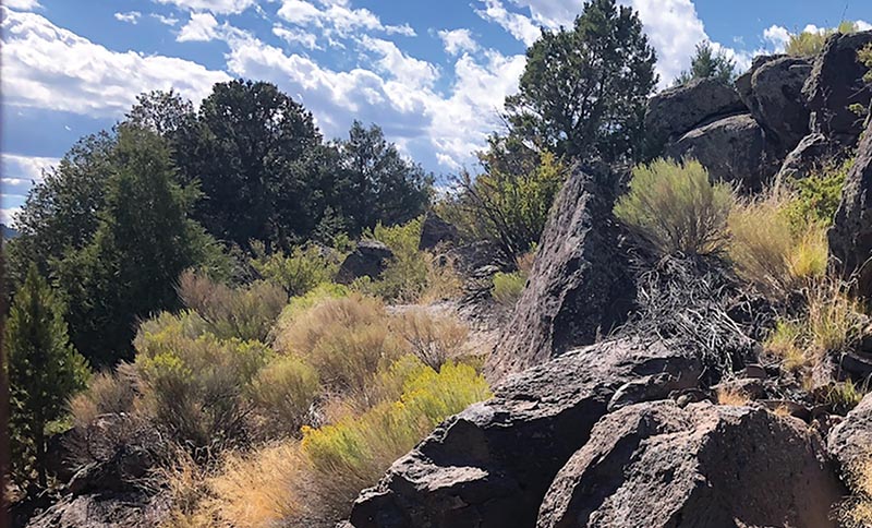
This scene is along the Cumbres & Toltec Scenic Railroad near Big Horn, Colorado. The rocks in the photograph have lots of texture and color. The variety of bushes and trees make the scene really interesting and is begging to be modeled.
When I try to gather the materials and formulate a plan to scenic a part of my layout, or when I’m trying to create a new tree or bush technique, I start by looking at the prototype and break it down into shape, texture, and color. For example, when trying to replicate a tree I look at how the trunk and branches are formed. Is the trunk a single stock or is it a cluster of trunks? If it’s a deciduous tree, what is the shape of the leaf canopy? If it’s a coniferous tree, do the branches droop downward or do they point upward or both? For figuring out the texture of a tree, it’s important to get the bark texture correct where it shows. How the needles or leaves fall upon each other also creates a texture. Finally, it comes down to color. Color is never solid in nature, it’s always a series of shades of different colors. Light reflecting off leaves and needles creates the appearance of different shades of green. Using my artists eye, I try to break down those individual colors and find suitable scenery materials and/or paint.
For the sake of this article, I’ve included photographs of common Colorado scenery. Paired with these photos is a breakdown of the scenic elements. Within those elements, I’ve identified the color palette for the subject. Within the captions I’ve included my thoughts on shape, texture, and what common scenery supplies might apply. Although I’ve used Colorado scenes for examples, the techniques I’m presenting can be applied to any type of scenery from east coast deciduous forests, to deserts, to tropical rainforests. The concept of shape, texture and color always apply.
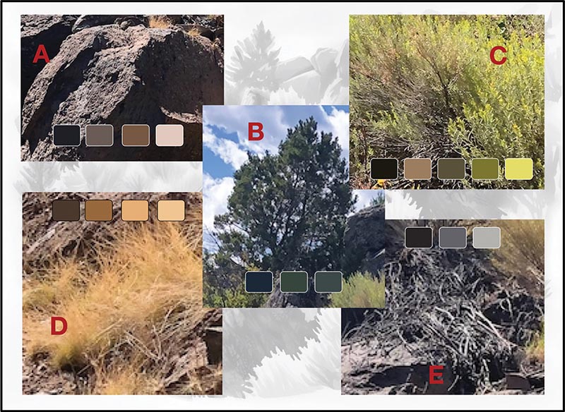
(A) Rock isn’t one color. The shadows are dark, the base rock has a couple different tones of brown and the sun is creating highlights on the rock. In an upcoming GAZETTE, I will be demonstrating an airbrush and dry brush technique that I’ve developed to replicate this. (B) The pine tree is probably a Piñon (or Pinyon) Pine and the branches all point upwards. The needles appear as different shades of green due to the way the sun is shining on them. See my interpretation for modeling Piñon Pines in the Sept/Oct 2025 GAZETTE. (C) Modeling the older branches for this bush should be done with a dark brown with light brown highlights. The new growth branches are multiple shades of green. Depending on your modeling scale, Noch leaves and/or static grass could be used for simulating the texture of the branches. A light misting from an airbrush would help to create the range of greens and yellows. (D) Static grass could be used to simulate this grass. The European suppliers have some nice beige and yellow colors that could be used as a base. A misting from airbrush could be used to simulate the many shades of tan. See the Nov/Dec 2024 GAZETTE for more details on making static grass tufts. (E) The dead bushes appear to be a pile of dark brown and grey branches. Woodland Scenic static grass would be ideal and an airbrush essential for getting the colors right.
In visual arts, light is a critical element in two dimensional mediums because the highlights and shadows in a painting create the illusion of depth. Since we are working in three dimensions and typically don’t have a fixed light direction on our model railroads, we need to compensate for this through color and texture. On a textured surface, like bark, using dark colors for a base color and building out to brighter colors creates the illusion of sunlight highlighting the object because the dark colors create a simulated shadow. Using multiple colors of leaf or needle mate-rial simulates the random reflection of light. These techniques create the illusion of having a light source and adds “depth” to the texture.
The idea behind breaking down a scenic element into its basics goes a long way to creating something more realistic looking in our modelling. But let’s not fool ourselves, we can’t recreate nature exactly, but we can create an illusion of being real. For myself, I know that I’m successful when the scene is close enough to reality that my brain fills in the pieces to convince me that it looks real; it’s the same concept learned in the stump drawing art class. Adding lots of texture through the addition of many complimentary scenic elements, fools your brain into believing something looks real. When the scene is so busy with scenic elements that your eye can’t focus on individual items, you are in the zone of fooling your brain. That said, if you add just a small number of details that are out of place, the illusion quickly comes crashing apart…